How Does Screenprinting Work?

How Does Screenprinting Work?

Processes

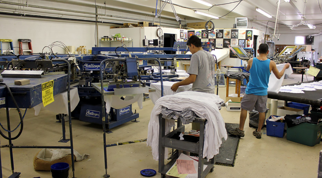
Many of our customers still aren’t completely familiar with what screenprinting is and how it works. Let’s clear that up right now!

portland screen printing setup

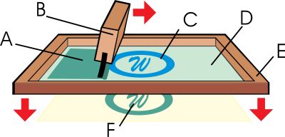
Basics of the manual screen printing process: A. Ink. B. Squeegee. C. Image. D. Photo-emulsion. E. Screen. F. Printed image.

Screen printing is a printing process that dates back to 960 AD. It uses a woven mesh (silk in earlier times and polyester in modern times) stretched around a wooden or metal frame to support an ink blocking stencil. Technology has come a long way in terms of stenciling method and today a light-sensitive emulsion is used. Screens are first coated with this emulsion and allowed to dry. A clear film with black in any area ink should print, is placed on the screen.

This is hit with a strong light source causing the clear areas to harden, and the areas under the black to stay soft.

The screen is then sprayed with water, washing away the areas where the ink should go through the screen.

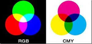
Each screen prints one color. You may notice with earlier examples of screenprinting that images tend to be large blocks of color. With all of the graphics technology developed over the last 30 years, we can now use complex dot patterns to achieve photographic quality – that’s how detailed this process can be!

screen-printing-hand-bench-in-portland-oregon

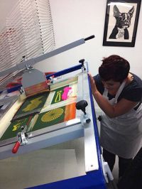
Screenprinting four layers
on a hand bench

The screenprinting process is used on fine art, t-shirts and other apparel, and many promotional products. It’s a popular process because of the vibrant colors it can produce.  In terms of fine art, many of you may be familiar with the Andy Warhol Campbell Soup Can series, or the Marilyn Monroe prints. In the world of fine art, the process is known as Serigraphy.

While more industrial applications of screen printing typically involve one to six colors, serigraphy may include twenty to fifty screens/colors for an art piece.

We’ve watched the industrial screen printing process evolve over the last 30 years. As was mentioned earlier, vastly improved graphics capability is probably the biggest reason for this. Computer graphics in general have revolutionized the process by allowing for exact line to line color separations. This means no overlap – unless it’s needed.

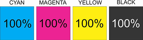
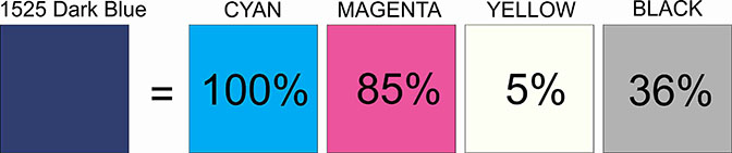
Because t-shirts can be printed wet on wet, and cured after all of the colors have been applied, this allows for a much cleaner and higher quality print. Four color process separations (or CMYK) printing allows for the fine detail associated photo images. Those designs are also printed wet on wet, but with a transparent ink that allows the colors to blend.

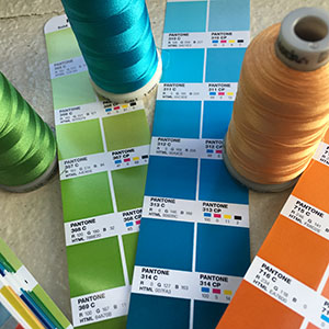
Another game changer has been the types of ink available. The quality of inks has improved and the choices in specialty inks have increased. For example, glitter or shimmer inks, which incorporate metal flakes, create a sparkle effect. Metallic inks are similar but use a smaller flake, making it more conducive to detailed images. Puff ink expands in the drying process giving a raised 3D effect. Suede ink contains an additive that gives the dried ink a suede look and feel.

There are additives that allow for printing on nylon, and stretchy fabrics. The most common t-shirt inks are plastic based and as with most inks, require heat for the image to cure.

Here are some things you may wish to consider when planning your next screenprinting project…

  • Is your artwork conducive to your substrate? If your design is very detailed, it will print better on a smooth T-shirt than a coarse canvas tote bag.
  • Is your artwork conducive to the inks you’d like to use? Glitter and shimmer inks need to print through a course screen mesh size. Detailed art needs to print through a finer mesh.
  • Will your artwork work on different garment styles? If practical, this is advantageous for pricing. Our quantity price breaks are based on the screen set up. So if you have 24 t-shirts, 30 crewneck sweatshirts, and 18 hooded sweatshirts – all getting the same size logo – they can be combined to get to our 72-piece price break.
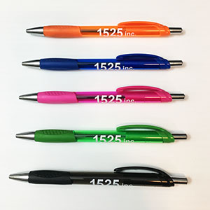
  • On a promotional product, such as a pen, what is the image area size? Sometimes you may have to make minor modifications to insure that text is legible on smaller items.

At 1525, we have extensive screenprinting knowledge having owned and operated large, high volume, production facilities in the past. It’s part of our job to take all of these variables into consideration to maximize the quality and cost effectiveness of your projects.
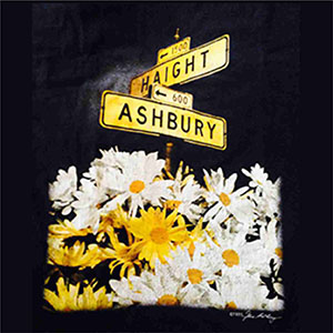
Haight Ashbury

Here’s a little something that we printed in the 1980’s.  The artist who produced the separations for this design did an EXCELLENT job!!  The T-Shirt sure held up well.
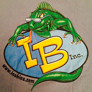
Jay the Iguana

Jay was the mascot of our second business.  This was such a popular design with our customers and looked wonderful no matter what color garment we printed it on.  As you can see – from 2003. 

Knowledge is Power!

I hope you found this information useful.  Once again, thanks for stopping by!  🙂

ta da da da da da da….  feeling Groovy!!


Recent Blog Posts

Archives

Categories

by Feb 23, 2017 No Comments
Everything You Need To Know About COLORS

Everything You Need To Know About COLORS

Branding

Colors are a very important component of branding.  Think of the red of the Target logo, or the green in the Starbucks logo.  In many cases the color is as important as the graphic element.  Trust me when I say that if Target were to receive an order and their logo was printed the wrong color – it would be rejected.  So the question is this.  How does one insure that colors are consistent?

The answer to this can be found in the following four acronyms:  CMYK, PMS, RGB, HEX

CMYK and PMS are the color models used for printing.  RGB and HEX are color codes associated with websites – the colors on your monitor.  Let’s go through each one so you can better understand why it’s a good idea to KNOW YOUR COLORS!  One concept to keep in mind is that white is all color, and black is the absence of color.


CMYK:  Cyan, Magenta, Yellow, Key (black) 

CMYK (also referred to as four color process) is achieved by printing ink through four set ups – one each for cyan, magenta, yellow, and black.  The set up will dictate how much ink lays down so that different colors can be achieved.  The ink used in CMYK printing is transparent in nature allowing colors to blend.  The printing substrate is white.  If it weren’t, then the substrate color would greatly impact the color mix results.  This is why CMYK is considered a subtractive color model.  The substrate it’s printed on is white and the ink subtracts from the brightness of the white paper.

The colors above show each color at 100% intensity.  Different colors are achieved by adjusting the percentages.  For example, the CMYK code for our dark blue color is 100,85,5,36.


What happens when my dark blue is the only color I want to print?  After all, four set ups to achieve a single color isn’t very efficient or cost effective.  This was addressed in the 1950’s with the birth of the Pantone Matching System.


PMS:  Pantone Matching System

In 1956, advertising executives brothers Mervin and Jesse Levine, hired Lawrence Herbert as a part-time employee. Herbert used his chemistry knowledge to systematize and simplify the company’s stock of pigments and production of colored inks.  Eventually, he bought out the company and focused all efforts on producing color chips and fan decks depicting his color matching system.  Finally, manufacturers in different locations could all refer to the Pantone system to make sure colors matched and were consistent from one run to the next. 

Thirteen different pigments plus black are used to mix PMS colors.  Also, the formulations allow for changes in opacity enabling colors to potentially be printed directly onto non-white substrates.  PMS is the most common color model for T-Shirt printing. 

In nature, the number of colors is almost infinite.  But the number of PMS or even CMYK codes is not.  In fact, not every CMYK color has a corresponding PMS number.  This is pretty important to keep in mind when selecting colors for your own logo. 

PMS formulations have come a long way since the 1950’s with new colors being added all of the time.  There are also formulations for metallic colors and neons.


RGB: Red, Green, Blue

RGB is a color model used to identify colors as seen on a computer monitor.  It is an additive color mode because the background of monitor screens is black. The individual LEDs then light up in varying intensity adding light to black. The variations in intensity of each color determines what color the user sees.  The following graphic shows the difference between RGB and CMYK quite nicely!


RGB starts on black and adds color, culminating in white at the center as shown.  The CMY model begins on white and takes away color culminating in black at the center.  You may notice the black or “K” missing here.  Technically the CMY will create black, but it takes very heavy coverage to achieve this.  Black was included in the model to create production efficiency.


RGB Codes are made up of three numbers, each between 0 and 255.  The code for black is 0,0,0.  The code for white is 255,255,255 – and all of the other colors fall somewhere in between.  Going back to the 1525 Dark Blue – our RGB color is 0,36,105.  If I am preparing a graphic to be seen on a computer, I need to save the art file with an RGB color mode.  If I decide to print that same design on paper, I need to save the art file as CMYK. 


HEX:  Hexidecimal 

HEX numbers are used when building and editing websites in HTML.  They are hexadecimal triplets representing the colors red, green, and blue (#RRGGBB). For example, in the color red, the color code is #FF0000, which is ‘255’ red, ‘0’ green, and ‘0’ blue. These color codes can be used to change elements of a web page.  As you can see from the example, hex numbers can be alphanumeric.  In the case of our dark blue, the code is all numbers:  #002469.  Another observation is that every RGB code has a corresponding Hex number. 


In conclusion…

Most, if not all companies use digital media AND print media in the marketing of their brand.  You can see then how important it is to have your colors translated into all four of these color models to insure consistency in your branding.  If you are working with a graphic artist (a service that we offer), be sure to let them know you need all four

Don’t forget about embroidery thread!

Most embroidery thread manufacturers cross reference thread colors with PMS numbers.  Sheen is also a factor in the overall look.  You can request a sew out to make sure your thread color is a good match.

1525 Logo

Dark Blue: 
100,85,5,36   PMS 281   0,36,105   0#002469
Light Blue:
68,34,0,0   PMS 279   87,138,214   #578AD6
Gold:
0,41,100,0   PMS 137   247,163,10   #F7A30A

Knowledge is Power!

I hope you found this information useful.  Once again, thanks for stopping by!  🙂

ta da da da da da da… feeling groovy!!!


Recent Blog Posts

Archives

Categories

by Feb 11, 2017 No Comments
Selecting Trade Show Promos

Selecting Trade Show Promos

Promotional Products

People LOVE free stuff!  The question is, how do you create a win-win situation when you give away items at a trade show?  After all, you are looking for some sort of return on your investment. Right?? 🙂

If you read our last blog post, you understand that it’s important to plan.  Understanding what you are trying to accomplish at the show and making sure your decisions are consistent with those goals is an important first step.  Once you’re past the big picture, it’s time to get to the nitty-gritty and choose promotional items that will get the job done. 

You should have these two goals in mind when choosing your tradeshow promotional items.

  1. They should help bring traffic to your booth.
  2. Once your prospect takes it home, they should serve as a reminder of what you have to offer, and how to contact you.

Now that we have that clarified, here are variables to consider when selecting promotional products. 

Budget

Think about what you have to spend per item.  Keep in mind the quality for the price point you are trying to hit.  If you have $2.00 per item to spend, get the highest quality product for the money rather than a cheap version of a higher end item.

Function/Aesthetics

Get something that won’t be thrown away after the show.  It would be very disappointing to leave the show and find your give-away item in the trash!  Ask yourself this questions.  Would YOU keep the item?  Maybe touch bases with a few existing customers for feedback.

Identifier

Make sure your company name and contact information is on your promo item.  If you can include your logo or tagline, that’s great!  If not, then as a minimum you will need your company name and a phone number or web address.  Present your information in a pleasing way.  Remember, you want your prospect to keep it.

Premium Items

It may make sense to have two levels of give -way items available. If you pick a more expensive “premium” product, only give it to your qualified prospects. You can ask the prospect, “Would you be interested in our product/service? I just need to ask you a few questions.” If the prospect turns out to be “not qualified”, thank them for their time and give them a pen or other low-cost item. They’ll leave with a practical gift, and may perhaps refer you to a friend.  If the prospect IS qualified – then the premium product can help you stand out, and make a better connection with that person.

Good luck at your next tradeshow!!!


General Give-away item

This was our give-away at the OAME Tradeshow last year.  It’s a low cost but good quality product with our company name, phone number, and web address on it.

Premium  Give Away Item

This pen was our “premium” item.  The show’s focus was the construction industry, so the level, rulers, phillips and flat head screw driver features were a huge hit.  People came searching for our booth after seeing other attendees with this pen!

Knowledge is Power!

I hope you found this information useful.  Once again, thanks for stopping by!  🙂


Recent Blog Posts

Archives

Categories

by Jan 18, 2017 No Comments
3 Keys to a Successful Tradeshow

3 Keys to a Successful Tradeshow

Promotional Products

Does tradeshow marketing work?

In the cyber age of smart phones, facebook, email, and twitter, does it make sense to participate in tradeshows?  My thought is yes, it does make sense.

There are still plenty of people who look for face to face interaction, and a chance to actually see and touch products.

Tradeshow marketing gives an exhibitor the opportunity to meet with hundreds of potential customers.  Attendees can already be classified as motivated prospects! 

Success though, is not guaranteed.  The following three keys can greatly increase your chances for a successful show.

Key #1:  PLAN

1.  Figure out what you want to accomplish and set goals for the show.  How many people do you want to meet?  Are you looking to get orders at the show, or just creating visibility for a new product?  Write down your goals so you can measure your effectiveness.

2.  Make a checklist so you don’t forget any important details.  This might include things like:  get a booth space, design the booth, determine if any collateral materials need to be developed and ordered, contact current customers to let them know you’ll be in the show.

3.  Create a timeline with deadlines so that you don’t end up with unnecessary emergencies.  If you wait until the last minute, the odds are high that something important will have been overlooked.

4.  Promote the tradeshow!  Let people know you’ll be there.  Here’s where email and social media can be very helpful as well as postcards, and phone calls.

5.  Decide on a tradeshow giveaway.  It should be something that helps attract prospects to your booth, and once back home, reminds them who you are and how to contact you.

6.  After the show, have a debriefing session to determine what things you did worked, and what did not.  Brainstorm ideas you may want to incorporate into your next show based on this show’s results.  It’s important not to wait to do this. 

Key #2:  QUALIFY

Hopefully you will have a lot of traffic through your booth.  Definitely be friendly and greet everyone, but if you have a chance to have a conversation beyond that, use it to qualify the prospect.  Ask a few questions that will help you determine if they are likely to become a customer.  The question could be as simple as, are you in the market for our product or service? 

If it seems unlikely that the prospect will convert to a customer, keep the conversation short and move on to the next prospect.  There are only so many hours in a day – use as much of them as you can talking to qualified prospects.

Key #3:  FOLLOW UP

This may seem like common sense, but it is very easy to slack on this most important step.  You come back from the show, you’re behind on your regular work, and you may feel a bit overwhelmed.  You reason that you’ve handed out business cards and tradeshow promotional products – the customer can call you when they’re ready. 

But – what you need to keep in mind is that your potential customer is going through exactly the same thing!  They come back, they’re behind on their regular work, and they have a box filled with business cards and assorted promotional products they’ve picked up from each booth. 

So here’s what you do.  Maybe wait two or three days, for them to settle down a bit, and then make a follow up phone call.  If you’ve had a chance to write some notes regarding each prospect, you can say something that helps them know that you remember who they are.   And – don’t stop with one call.  Depending on interest, you may follow up again in a week, a month, or some other agreed upon timeframe.

Participating in a tradeshow takes time and money.  Following the advice above will help you to increase the return on your tradeshow marketing dollars.

What should I give away?

This is an important question and one I’ll be addressing in our next post.

Would you like to do a little internet surfing now?

Click HERE for more information.

Knowledge is Power!

I hope you found this information useful.  Thanks for stopping by! 🙂

Recent Blog Posts

Archives

Categories

by Jan 13, 2017 No Comments
What is Vector Art and WHY should I care?

What is Vector Art and WHY should I care?

Branding

In this biz, all customized projects begin with artwork.  If you want a high quality finished product – you need high quality, process ready, digital art.  Your beautiful drawing is not digital art, and the logo you pulled off of a website header may be digital, but it is not high quality.

Digital art has either a vector format or a raster format.

Vector artwork is digitally created with shapes, lines, curves, or paths that can be easily colored, manipulated, and resized without affecting the quality of the image.  It will look just as good on the side of a building as it does on your coffee cup.  Common art file formats include:  ai, pdf, cdr, eps.  It is important to note that pulling raster art into a vector program and saving it with the required extension, does not make it vector art.

Raster Artwork is digitally created using pixels.  Quality of a raster image can be negatively affected by being re-colored, manipulated and/or resized.  Processes that are conducive to raster art typically require at least 300 dpi (dots per inch) resolution at the finished size.  In our coffee mug to building signage scenario, scaling the coffee cup art larger results in a significantly reduced dpi.  Raster art file extensions include jpg, png, psd, tif, bmp, gif.  Vector art files can be easily converted to raster files if needed.

As a customer, it’s helpful to understand this basic explanation of digital art.

Several months ago, when I spoke at a function about my company, I was asked what the most important advice was, that I could give to the audience. 

I answered, “MAKE SURE you have your vector art files.  In fact, if someone creates a logo for you, be sure to get both the vector and raster versions of it.”   

We have a full service art department, but often customers already have their art.  If I open a supplied vector file, I will always cross reference it to the raster file, to make sure that it opened correctly.  Depending on the program it’s created in, another program may not display it exactly the same way.  I won’t get into the technicalities of this now.  Suffice it to say that the raster version can’t be manipulated so it will always be a true representation of the art.  When we create vector art for customers, the proof is sent in a raster version for exactly this reason.

Branding is important!  Your logo is a big part of your identity.  Make sure it looks as good as it can!

Low Resolution Image

Here is an example of a raster version of our logo.  We’ve scaled the original art file to a larger size to show you the distortions that this creates.

High Resolution Image

Here is the same logo saved at a high resolution.  The logo was in fact created as vector art, and then converted to raster.  Website images are saved in this manner usually as a jpg or png. 

Knowledge is Power!

I hope you found this information useful.  Once again, thanks for stopping by!  🙂


Recent Blog Posts

Archives

Categories

by Jan 9, 2017 No Comments
Call Now Button