Everything You Need To Know About COLORS
Branding
Colors are a very important component of branding. Think of the red of the Target logo, or the green in the Starbucks logo. In many cases the color is as important as the graphic element. Trust me when I say that if Target were to receive an order and their logo was printed the wrong color – it would be rejected. So the question is this. How does one insure that colors are consistent?
The answer to this can be found in the following four acronyms: CMYK, PMS, RGB, HEX
CMYK and PMS are the color models used for printing. RGB and HEX are color codes associated with websites – the colors on your monitor. Let’s go through each one so you can better understand why it’s a good idea to KNOW YOUR COLORS! One concept to keep in mind is that white is all color, and black is the absence of color.
CMYK: Cyan, Magenta, Yellow, Key (black)
CMYK (also referred to as four color process) is achieved by printing ink through four set ups – one each for cyan, magenta, yellow, and black. The set up will dictate how much ink lays down so that different colors can be achieved. The ink used in CMYK printing is transparent in nature allowing colors to blend. The printing substrate is white. If it weren’t, then the substrate color would greatly impact the color mix results. This is why CMYK is considered a subtractive color model. The substrate it’s printed on is white and the ink subtracts from the brightness of the white paper.
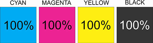
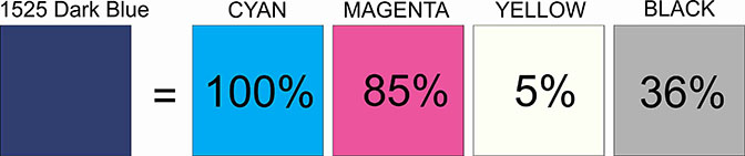
The colors above show each color at 100% intensity. Different colors are achieved by adjusting the percentages. For example, the CMYK code for our dark blue color is 100,85,5,36.
What happens when my dark blue is the only color I want to print? After all, four set ups to achieve a single color isn’t very efficient or cost effective. This was addressed in the 1950’s with the birth of the Pantone Matching System.
PMS: Pantone Matching System
In 1956, advertising executives brothers Mervin and Jesse Levine, hired Lawrence Herbert as a part-time employee. Herbert used his chemistry knowledge to systematize and simplify the company’s stock of pigments and production of colored inks. Eventually, he bought out the company and focused all efforts on producing color chips and fan decks depicting his color matching system. Finally, manufacturers in different locations could all refer to the Pantone system to make sure colors matched and were consistent from one run to the next.
Thirteen different pigments plus black are used to mix PMS colors. Also, the formulations allow for changes in opacity enabling colors to potentially be printed directly onto non-white substrates. PMS is the most common color model for T-Shirt printing.
In nature, the number of colors is almost infinite. But the number of PMS or even CMYK codes is not. In fact, not every CMYK color has a corresponding PMS number. This is pretty important to keep in mind when selecting colors for your own logo.
PMS formulations have come a long way since the 1950’s with new colors being added all of the time. There are also formulations for metallic colors and neons.
RGB: Red, Green, Blue
RGB is a color model used to identify colors as seen on a computer monitor. It is an additive color mode because the background of monitor screens is black. The individual LEDs then light up in varying intensity adding light to black. The variations in intensity of each color determines what color the user sees. The following graphic shows the difference between RGB and CMYK quite nicely!
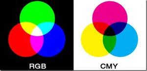 RGB starts on black and adds color, culminating in white at the center as shown. The CMY model begins on white and takes away color culminating in black at the center. You may notice the black or “K” missing here. Technically the CMY will create black, but it takes very heavy coverage to achieve this. Black was included in the model to create production efficiency.
RGB Codes are made up of three numbers, each between 0 and 255. The code for black is 0,0,0. The code for white is 255,255,255 – and all of the other colors fall somewhere in between. Going back to the 1525 Dark Blue – our RGB color is 0,36,105. If I am preparing a graphic to be seen on a computer, I need to save the art file with an RGB color mode. If I decide to print that same design on paper, I need to save the art file as CMYK.
HEX: Hexidecimal
HEX numbers are used when building and editing websites in HTML. They are hexadecimal triplets representing the colors red, green, and blue (#RRGGBB). For example, in the color red, the color code is #FF0000, which is ‘255’ red, ‘0’ green, and ‘0’ blue. These color codes can be used to change elements of a web page. As you can see from the example, hex numbers can be alphanumeric. In the case of our dark blue, the code is all numbers: #002469. Another observation is that every RGB code has a corresponding Hex number.
In conclusion…
Most, if not all companies use digital media AND print media in the marketing of their brand. You can see then how important it is to have your colors translated into all four of these color models to insure consistency in your branding. If you are working with a graphic artist (a service that we offer), be sure to let them know you need all four.
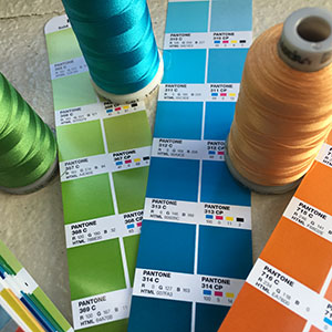
Don’t forget about embroidery thread!
Most embroidery thread manufacturers cross reference thread colors with PMS numbers. Sheen is also a factor in the overall look. You can request a sew out to make sure your thread color is a good match.
1525 Logo
Dark Blue:
100,85,5,36 PMS 281 0,36,105 0#002469
Light Blue:
68,34,0,0 PMS 279 87,138,214 #578AD6
Gold:
0,41,100,0 PMS 137 247,163,10 #F7A30A

Knowledge is Power!
I hope you found this information useful. Once again, thanks for stopping by! 🙂
ta da da da da da da… feeling groovy!!!